Lift coffee label branding + process
Design and process to create four sets of coffee labels for Joyya (formerly Freeset) USA

Front of “Lift” Brazil Daterra Estate coffee beans label
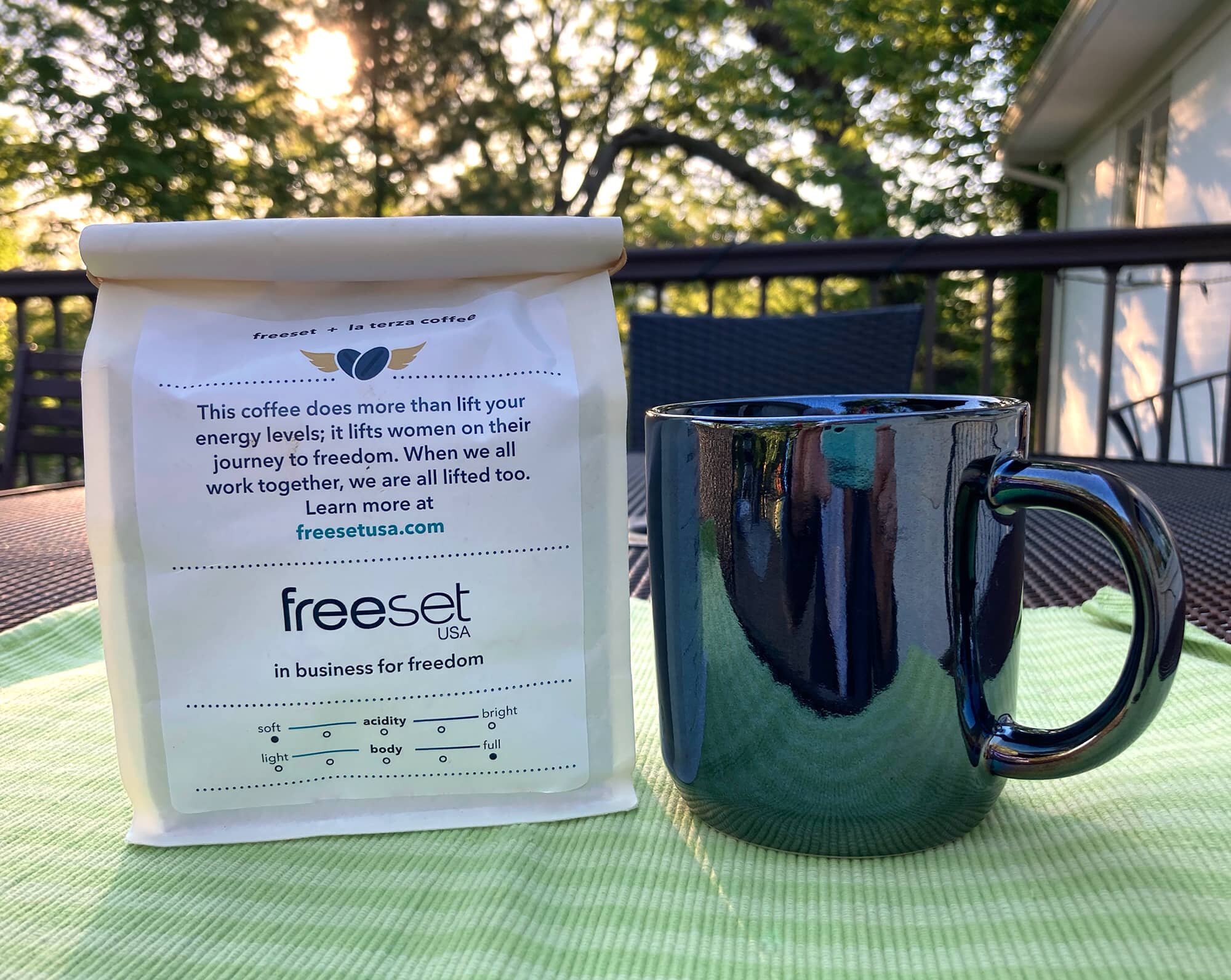
Back of “Lift” Brazil Daterra Estate coffee beans label
Problem:
Joyya (formerly Freeset) USA needed branded packaging labels for limited-edition coffee roasts to raise money from online sales. The design needed to reflect Joyya’s branding and mission, and appeal as a Father’s Day gift. The labels needed clear distinction between whole bean and ground coffee, and distinction between two different roasts. They needed an upscale look to help justify the $20 retail price.
MY ROLE:
Concepting, design layout, illustration, adhering to brand guidelines, project management, and communication with client.
COLLABORATIONS:
Joyya Global Director of Sales and Marketing, and La Terza Coffee Roasters' Marketing & Operations Manager.
CHALLENGES:
One-week deadline; I had to begin concepts for the labels before the product was named, and fitting required copy into a small space.
DELIVERABLES:
Used Adobe Illustrator and Acrobat to create print-ready art files for labels.
RESULTS:
I delivered the project on time, pleased my client, and helped them with a successful, brief pivot in product sales due to Covid.


Concept phase
Step 1; Research and sketch thumbnails. Step 2; Create illustrations and layouts. See two different concepts above for each flavor. I initially explored a lotus flower/bean design symbolizing beauty and rebirth. My client preferred the concepts with colored backgrounds, and we decided to move forward with all sans-serif type.


Final designs
When Freeset decided that the name would be “Lift,” The coffee bean/lotus flower evolved into a winged heart to emphasize this idea. I also added the color gradients to the front of the whole bean labels to help differentiate them from the ground coffee bags.
Credits
Carrie Geygan
Product photography